In modern offices, colour choices are fundamentally business decisions. This is because the colours surrounding us influence our psychology: from our moods to our creativity and focus.
From subtle neutrals to striking accent hues, thoughtful colour implementation is the foundation of office interior design that aims to help people genuinely thrive.
Defining Colour Psychology
Colour psychology is the formal study of how colours affect human emotions, behaviours, and thought processes. It investigates the psychological responses different shades elicit and how these reactions can shift based on individual factors, such as age, personal history, and cultural background.
The field explores emotional responses, colour preferences, physiological impacts, behavioural influences, the effects of colours on mental health, and their practical application in design.
Applying Colour Psychology in the Workplace
The serious study of how colours affect the mind can be traced back to figures like Swiss psychiatrist Carl Jung in the early 20th century. Jung pioneered colour therapy, encouraging patients to use colours and images for self-expression.
Historically, various ancient cultures understood and utilised colour, using specific hues to treat conditions and influence human behaviour, often integrating them into spiritual practices.
Today, colour psychology is applied in the office. It involves the conscious use of colour in interior design to strategically influence employee’s emotions, perceptions, and actions in a commercial space.
Colour’s Influence on Employee Well-Being and Office Design
Designers are responsible for leveraging the power of colour in the workplace. What they do is choose shades that cultivate a comfortable and positive work environment that employees enjoy being in.
For example, when determining the best colour for office productivity, designers will choose colours proven to help staff manage stress, enhance concentration, and increase focus.
With this in mind, some colours carry universal psychological meanings:
- Warm Colours (red, orange, yellow): These are associated with positivity, energy, and excitement. However, using them too intensely or aggressively can risk triggering frustration.
- Cool Colours (blue, green, purple): These hues are linked to calmness, relaxation, and focus, creating a soothing workspace atmosphere.
- Neutral Colours (white, grey): These provide crucial balance and visual rest. Their undertones determine if they feel warm or cool, offering versatility in the overall design palette.
Leveraging Colour for Creativity and Productivity in Offices
We look closely at how specific colours affect employee performance to help you determine which colours best symbolise productivity, creativity, or calm in different zones in the workplace.
The Effects of Red
Red carries associations with urgency, efficiency, and determination. This energising colour should be strategically deployed in areas requiring physical activity, night-shift work, and high-intensity collaboration. It makes an effective accent element in boardrooms, too.
However, too much red can potentially increase anxiety and cause visual fatigue. Red works best when used deliberately as an accent, not a dominant wall colour.
The Effects of Blue
Often cited as the most productive colour, blue helps establish a balanced, calming atmosphere where employees can remain focused and efficient.
Blue environments are known to reduce heart rate and blood pressure while improving concentration. This colour is particularly suited for research areas, focused work zones, meeting rooms where clear communication is vital, and financial or analytical departments.
One thing to note is that using blue exclusively without complementary colours can risk creating a feeling of coldness, so moderation is key.
The Effects of White
White is a cool colour, sometimes criticised for appearing too sterile. When applied in vast amounts, white can actually distract employees, potentially causing them to daydream or even leading to minor errors.
However, its clean nature is valuable when used sparingly. White works well as an accent to balance the intensity of brighter colours and is excellent for reflecting natural and artificial light, making a workspace feel brighter.
The Effects of Green
Green shares many of the soothing psychological effects of blue. Even better, it’s widely considered one of the least demanding colours for the eyes and the brain.
Consequently, green is utilised in many of the same settings as blue, such as meeting rooms and educational facilities. Its easy visibility also makes it a popular choice for hospital rooms to help reduce eye strain for medical staff during long shifts.
Furthermore, green facilitates alertness. And given the growing awareness of environmental concerns, green’s association with nature makes it a prime choice for workplaces related to conservation or sustainability.
The Effects of Yellow
Yellow environments foster optimism, creativity, and mental stimulation.
This energising shade generates feelings of joy and positivity, making it invaluable in spaces that prioritise innovative thinking and collaborative ideation, such as creative departments, brainstorming rooms, and reception areas.
Like red, bright yellow should be applied with restraint, as overexposure may cause visual strain and anxiety in some individuals.
The Effects of Orange
Orange is seen as cheerful, friendly, and successful. It is a highly social colour that enhancing communication, collaboration, and teamwork.
However, while orange boosts optimism and creativity, like other warm colours, it can be linked to frustration if overused. It’s best used for wall art, statement furniture pieces, and decorative accents, especially in zones dedicated to team interaction.
The Effects of Purple
Traditionally associated with power and wisdom, yet capable of calming the mind, purple is a wonderfully versatile colour.
Deep purple can signal sophistication and prestige, perfect for channelling luxury for your brand. Including purple accents in meeting rooms and task-orientated areas can also foster confidence and enhance decision-making capabilities.
Meanwhile, soothing lavender shades, often seen in the wellness industry, can be incorporated into relaxation rooms or cafeteria areas to subconsciously signal that these zones are for unwinding and rejuvenation.
Strategic Application of Colour in Office Settings
Simply colour-drenching your walls green, or any other colour, may not achieve your desired effect. Instead, you might introduce small elements like plants and greenery to elicit feelings of calmness and productivity while gaining the physical health benefits of nature in the workspace.
When determining what the best colours for your workspace are, consider all aspects of your design that can carry colour. For example, posters, furniture, curtains, and even communal kitchenware can positively affect employees.
You can also reinforce your company branding: if your logo features red and yellow, using these colours for meeting area pillows subtly supports your brand’s identity. And, if your brand is associated with luxury and sophistication, or excitement and innovation, your colour choices should align with that narrative.
Collaborating with Design Experts
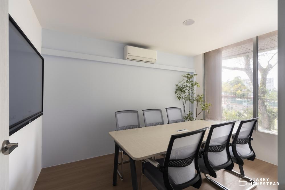
Crafting sensory experiences through colour in high-performance commercial spaces requires specialised expertise and psychological insight. This is where our award-winning interior design experts shine.
Our teams specialise in commercial environments and leverage years of experience to make colour theory work for your spaces and employees. We thoughtfully craft productive, appealing environments that reflect the ethos of your brand and support your team’s well-being.
Partner with Starry Homestead to ensure your office interior design project delivers measurable results and a harmonious atmosphere.
