SPATIAL DESIGN
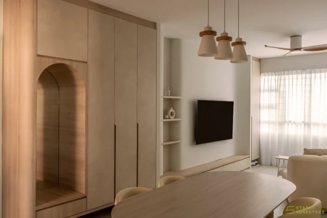
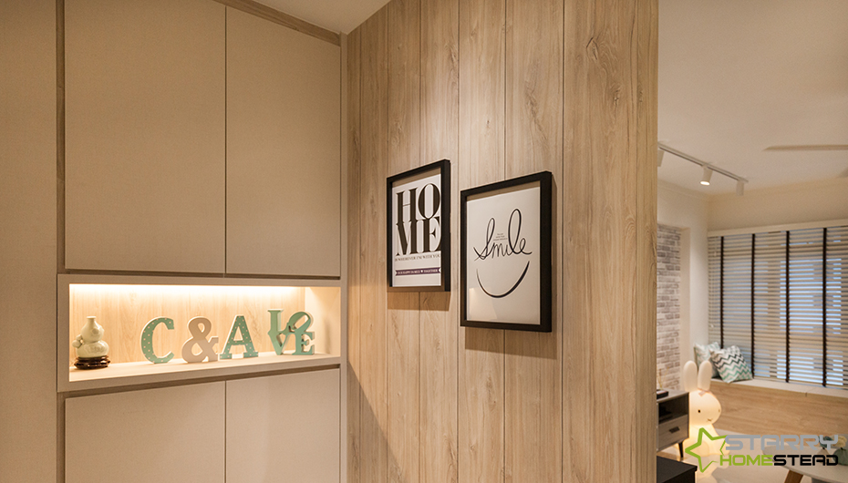
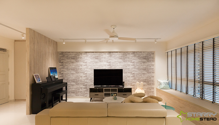
With sprawling 5-room apartments, the focus is less on expanding the space and more on creating clear demarcation between the zones especially in the communal area. The work that was performed on this project was exemplary of such nifty spatial arrangement. A small foyer equipped with a concealed shoe cabinet and a landing area for wallets and keys sits at the entryway of the flat. The design team created this area by constructing a partition to demarcate it from the main living room. Apart from serving to delineate the different zones, this wall also helps provide privacy for those lounging on the sofa. To utilise the area on the other side of the partition, a grand piano was placed here.
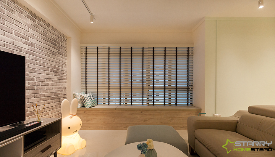
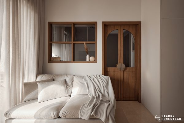
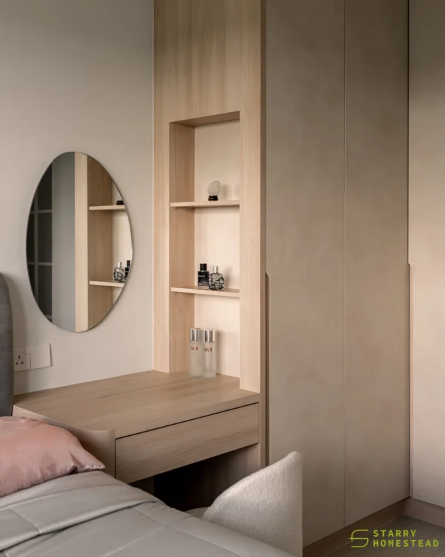
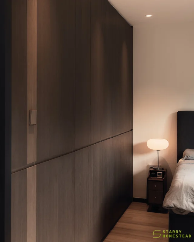
On the far end of the living room, bay window seating takes up the entire span of the window – a smart use of space. What’s more, it’s great for relaxing with a book and a cuppa and it’s handy when more seats are required if the couple has guests over. The kitchen follows a galley layout to take full advantage of the elongated span of space here. Even the master bedroom sees a smart configuration of space. A custom made wardrobe was used as a partition to separate the sleeping area from the dressing up area – giving the homeowners a sense of cocooning comfort when retreating for the night.
COMFORT
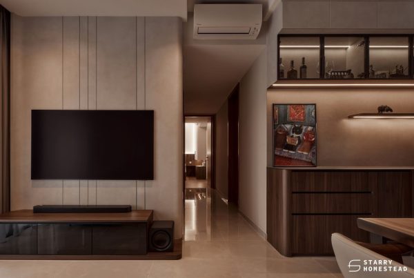
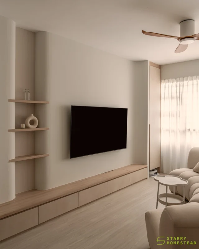
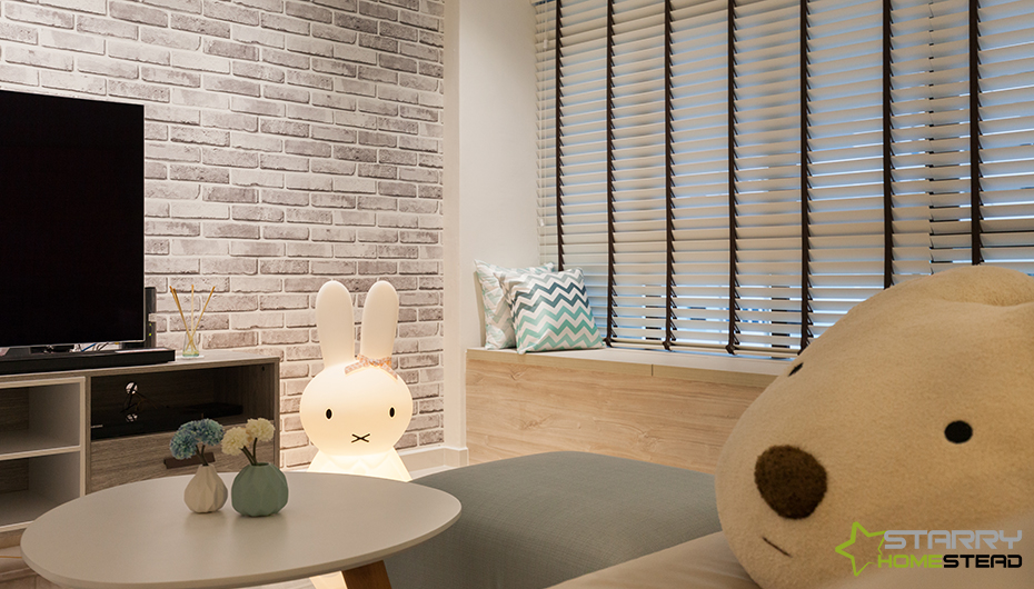
Wood undoubtedly possesses a unique quality that emanates a reassuring aura – and it is used with abundance in this Scandinavian styled home, starting from the living areas all the way into the bath space. The blend of pale wood toned surfaces and a neutral backdrop helps brighten and bring a cheery vibe into the space. This feeling of airiness is augmented by the use of lighting, from track and cove lights to statement pendant lamps. In the living area, the eye is soothed by a feature wall of bricks in a calming shade of light grey. An adorable cushion at the sofa heightens the level of comfort in this space, while throw cushions along the bay window seat make great company when it’s time to unwind. Instead of a conventional sharp edged coffee table, a petite one designed with smooth curves serve a practical purpose without taking up too much space. This way, there is ample space for walking and mingling.
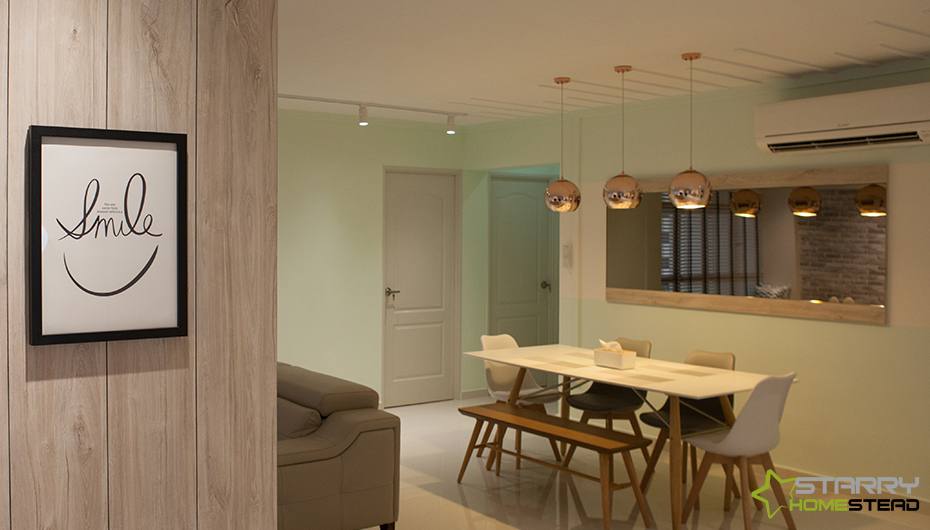
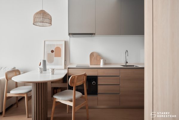
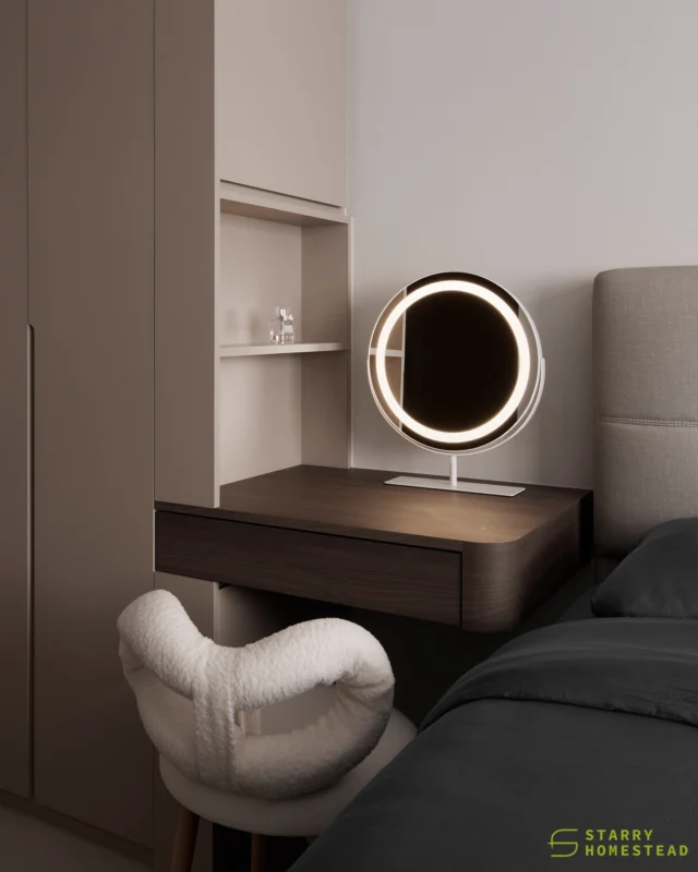
Over at the dining area, there is sufficient seating for six people or more. A bench lets one more guest squeeze in without sacrificing comfort. Deeper in the more private domain of the homeowners, the master suite is designed without any general ceiling lights. But it is still well lit all thanks to the cove lights fitted along the ceiling and at the wardrobe base to aid them when dressing up. Equipped with everything the homeowners require to start and end the day right, the bath space makes time spent here a relaxing one as well.
AESTHETICS
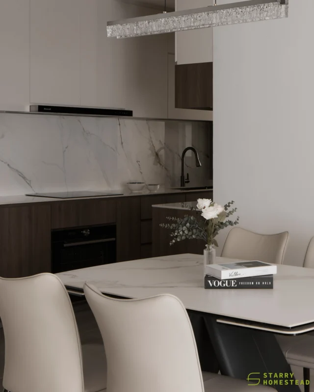
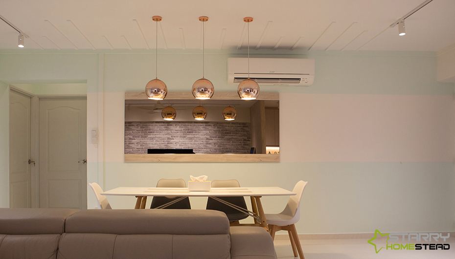
Scandinavian homes are well-loved for their warm simplicity and minimal appeal. Likewise, this apartment that’s fashioned after the popular Scandi style sports these design elements. The minimal look is achieved with the use of an almost all-white palette that’s enlivened with gorgeous pale wood tone veneers. This is exemplified in both the surfaces and furniture pieces used throughout the abode. Characterised by smooth lines and curved edges, organic elements lend a natural feel to an interior and is a mainstay of Scandi style. It is employed and most pronounced in the dining space. To ensure this space is kept far from monotonous, the team painted a simple pattern comprising an unexpected pop of pastel on the adjoining wall. Bringing a stylish sheen to this zone is the row of globular pendant lighting gilded in copper. In addition, a wall mirror framed in wood reflects the beauty of the feature wall in the living room. This feature wall, also the focal point of the living room, not only injects much-needed depth and texture into the room, it also provides a style boost to the simple space. Even the cooking space is very much Nordic inspired with the icy blue and brilliant white cabinet laminates that are warmed up by wood-effect surfaces that cover the floor.
INNOVATION
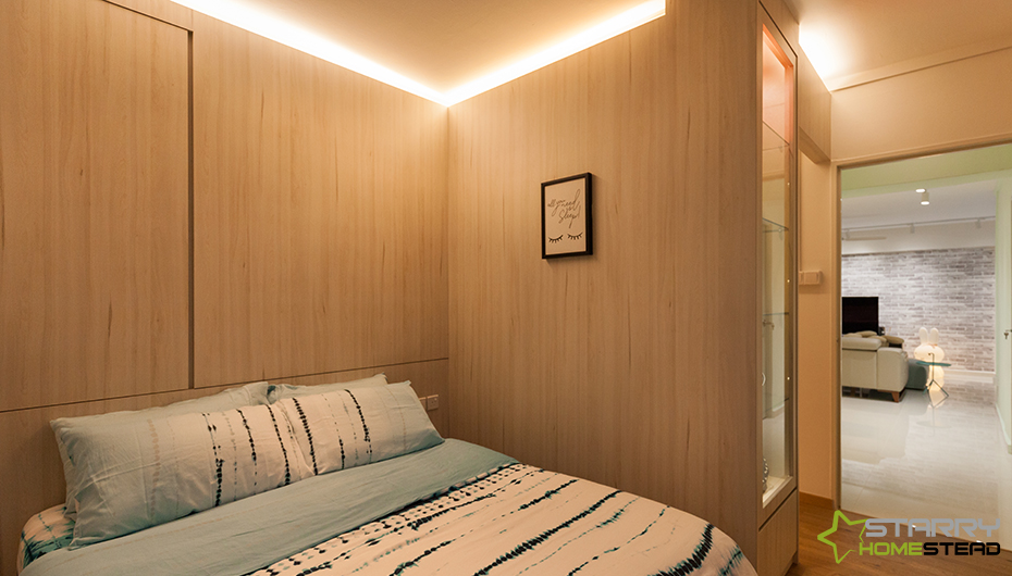
An innovative highlight of worth is the bed headboard feature in the master suite. It might appear unassuming, but this feature was purposely built to camouflage an unsightly window that leads out to the air-conditioning ledge. What could have stuck out like a sore thumb is discreetly and stylishly hidden behind closed doors. The adjoining partition that helps to enclose the sleeping area is also a purposeful design. It’s actually the rear of a custom made wardrobe that’s crafted seamlessly to appear like a wall – but it really isn’t.
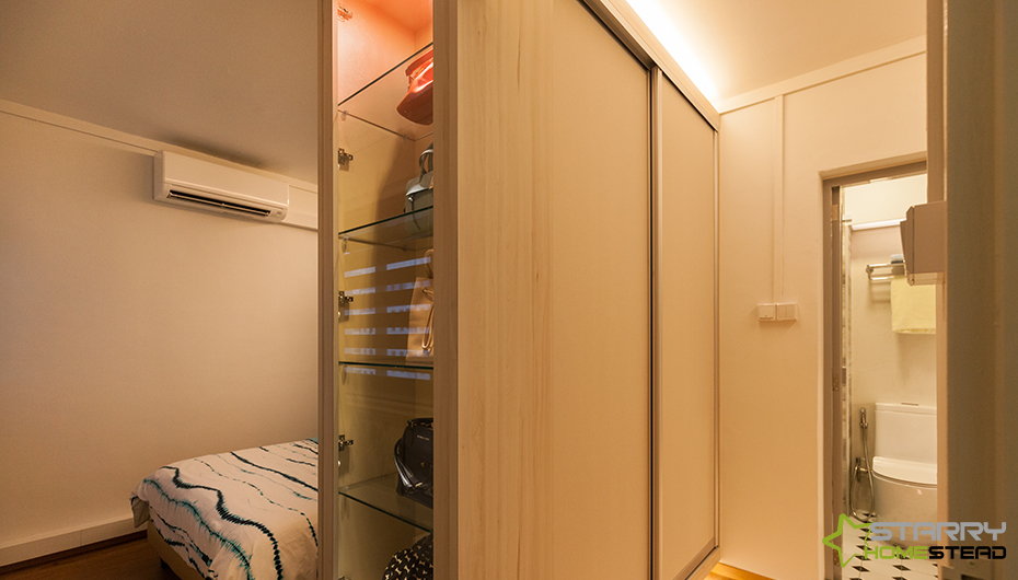
Sliding doors are employed for the wardrobe to tackle this tight span of space that leads to the bathroom, while cove lights at its top and base brightens the area to aid with dressing up, without disturbing the other partner who might still be at slumber. By the side, a glass display cabinet is aligned to the closet to display the lady of the house’s luxury bags. Out in the dining room, conduit piping that lines the ceiling is joined with other similar linear design elements to create visual interest here. Who would have thought that a practical function can be elevated into a design statement?
REALISATION EFFICIENCY
Drab and dated, the original condition of this 5-room HDB resale flat wasn’t quite the living quarters that the homeowners had in mind. Thanks to the experience and expertise of the design team, not only was the owners’ dream of owning a Scandinavian home realised, the team also addressed their personal requests and rectified issues inherent in the old house. Thus, transforming the timeworn apartment into a timeless home that makes everyday living a joy for the couple. What’s more, no removal of walls was needed for such a huge transformation. Hence, helping the owners to cut cost. Now, the communal zone is bright and breezy – perfect for unwinding or for the couple to invite family and friends over. In the master suite, the issue with the unsightly window was rectified with panache. Plus, smart storage solutions were implemented in every room to keep them organised and free of clutter. Even the bath space has been equipped with storage compartments that ensure every single items have their own designated spot.
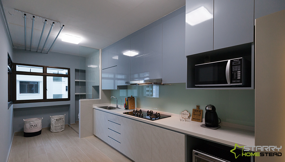
The cooking space is now a clutter-free zone that’s packed with more than ample storage space. In terms of their housekeeping needs, the corner near the window has been reserved for laundry – demarcated by a partition with a glass panel to ensure natural sunlight is still able to stream into the kitchen freely.
Shine with us. Follow now @starryhomestead
We improve people’s lives at Starry Homestead. Our experienced home and commercial interior designers create interior spaces that are not only beautiful and stylistic but also harmonious sanctuaries for meaningful living or working lifestyles. As a full-service, CaseTrust-RCMA approved interior design agency that offers personalised interior design and restoration services we are ever committed to delivering an award-winning interior design for our client’s home, workplace, or shop. Whether you wish to create a look of custom sophistication or a chic, contemporary style, Starry Homestead is here to help you achieve your interior bliss.


CUSTOMER SERVICE
EAST SHOWROOM
140 Paya Lebar Road
#01-01, AZ@Paya Lebar
Singapore 409015
(65) 6702 6866
CENTRAL SHOWROOM
511 Balestier Road
Singapore 329849
(65) 6264 6866
WEST SHOWROOM
18 Boon Lay Way
#01-101, Tradehub 21
Singapore 609966
(65) 6774 6866
HEADQUARTERS
18 Boon Lay Way
#01-101, Tradehub 21
Singapore 609966
(65) 6778 6866
enquiry@starryhomestead.com
Copyright © 2026 Starry Homestead Pte Ltd. All Rights Reserved. | Privacy Policy
