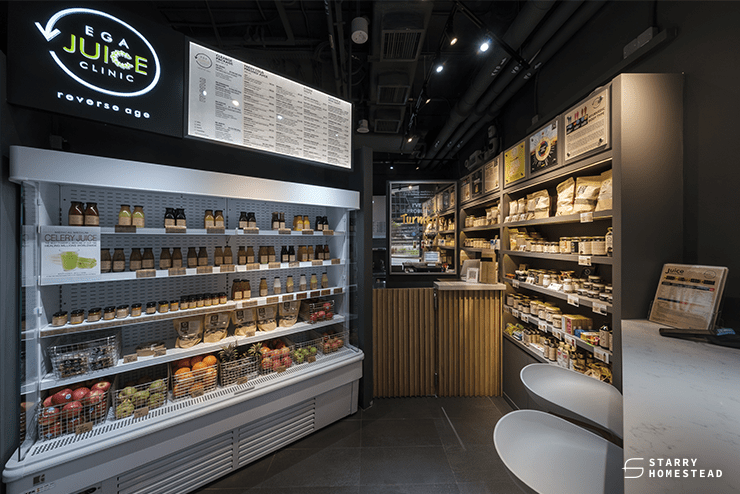
While retail interior design may seem too trivial to stress over, effective designs in your retail space can do wonders for your business. In addition to providing aesthetically pleasing retail spaces, retail interior design serves to boost sales, retain and attract customers, narrate your brand and product story, and lead your customers through the decision-making and purchase process.
There are many considerations to think about when planning your retail interior design. They include
- Sight Lines: The point of focus that your eyes are naturally drawn to as you navigate a store
- Merchandising Ratio: The number of products on display that affects visual appeal
- Customer Flow: Store layout that impacts customer experience and traffic
- Storage: Amount of space for display and storage of your goods
- Curb Appeal: The attractiveness of your store’s exterior and how it lures customers
Although visual merchandising and the design of your retail store contribute largely to the success of your business, the store layout and how effective it is at leading customer journeys and traffic flow within your store is another crucial component of retail interior design. In today’s article, we’ll show you a few retail store layouts to help you find the best one for your business.
1. Grid Floor Plan
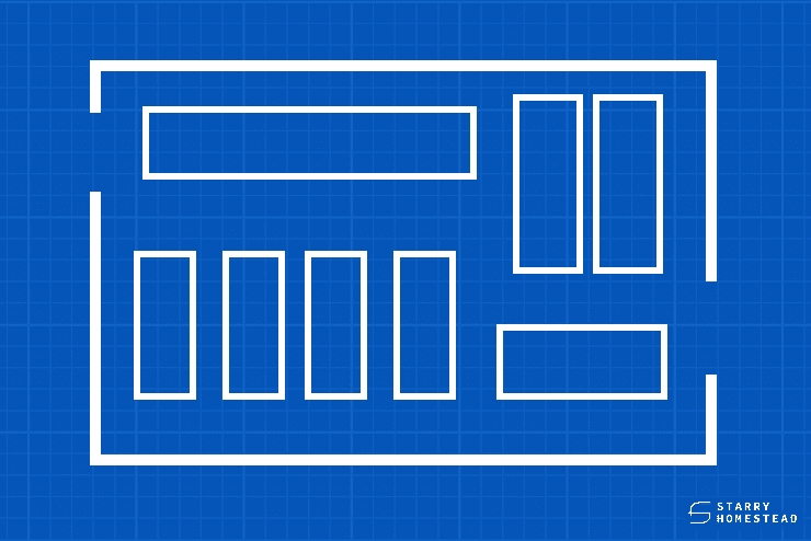
Grid floor plans are common in grocery stores, big box stores, pharmacies, convenience stores, and other similar establishments. The layout is simple and straightforward, allowing for clean and systematic storage of shelf-stocked goods such as books, toys, specialty foods, homewares, and more. This layout is ideal for brands with multiple product types and categories because it allows customers to easily navigate through aisles of products to quickly find what they need.
2. Loop Floor Plan
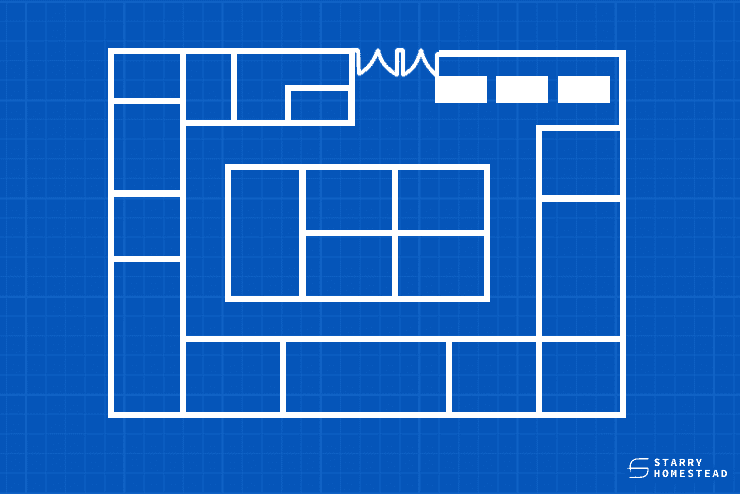
This floor plan maximises wall and vertical space to free up floor space while also leading customers down a set path. The loop floor plan is ideal for brands that sell clothing, accessories, toys, homeware, personal care products, and other related items. One of the primary advantages of this layout is that it keeps customers within your store by directing them to new items along the path and towards the cashier. However, if a customer decides to go in the opposite direction, the flow of traffic may be disrupted.
3. Free-Flow Floor Plan
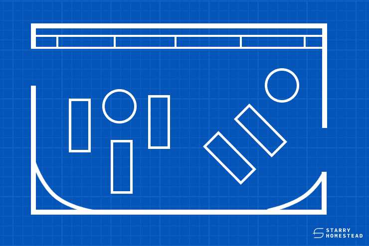
The free-flow floor plan is commonly used in specialty and boutique stores that sell clothing, accessories, and specialty brands, as well as in mixed-use stores like bakeries. This floor plan has no set path, allowing customers to freely browse the store in any direction they feel comfortable. It also enables you to experiment with more retail interior design ideas, such as creating thematic zones in your store, or easily change and update your interior.
4. Diagonal Floor Plan
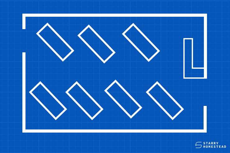
The diagonal floor plan is a grid floor plan variation that maximises visibility in retail stores and encourages more browsing. The shelves and racks are arranged diagonally so that employees can keep an eye on customers without getting too close to them. This floor plan is best suited for stores that allow customers to try out products, such as self-service kiosks, technology and electronics stores, and beauty and cosmetics retailers.
5. Angular Floor Plan
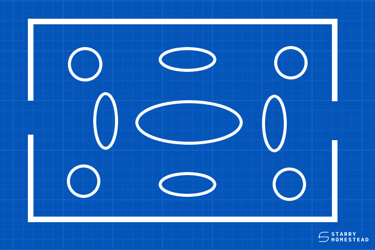
High-end specialty stores such as designer brands and artisans typically use an angular floor plan, with many smaller displays in the centre of the store to create a dynamic shopping experience. Retail stores may hire an interior design company to install curved walls and angular fixtures that create visual interest and an ideal movement, enticing customers to stay and shop.
Regardless of the types of products you sell, every retail store needs an effective layout and design to successfully attract and retain customers, as well as encourage purchases.
Starry Homestead is an interior design company in Singapore that has years of experience in both residential and commercial interior design. Let us help you design the perfect interior for a successful retail business.
