As the saying goes, “All good things must come to an end”. So does House Everything?, which has featured Starry Homestead’s interior design team for eight awesome weeks in this Channel 8 reality show. While it is sad to say goodbye to the series, let’s ignore the emptiness we’ll feel inside without it and saviour one more episode! In this finale, we encounter the most challenging task ever – overhauling the cluttered and messy living room of a family of five!
The Scenario
Meet Angeline and Malcolm, a married couple living with three kids aged 17, 13 and 3. Like any typical dual-income family, their busy lifestyle left them with scarcely any time to tidy up their home of 18 years. As a result, the living room was cluttered with mountains of clothes, toys, books, memorabilia and other personal items, all of which were piled up high – unorganised and unsorted – in the living room.
Also, the room had only a small window in the corner, which provided limited natural lighting. Added to that, the owners had chosen the wrong type of lighting fixture, which offered insufficient lighting and could only illuminate the room partially.
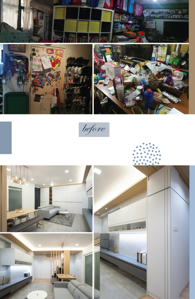
Having lived in chaos for years, the family of 5 finally gets an overhauled and uncluttered home.
The Challenge
The team’s challenge is to turn the messy living room into a comfortable and cosy sanctuary that the family can call home. It should be a place where they can dine together, relax after a long day and where the children can enjoy their playtime.
The Solution
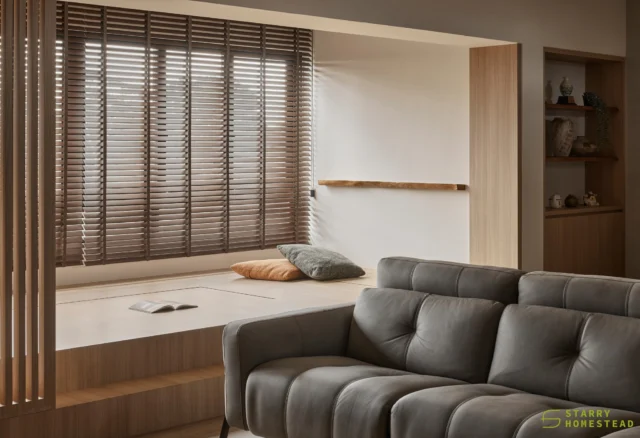
Interior designer Steven has chosen the Modern style of interior design because he has felt that a simple, modern home is exactly what a busy couple like Angeline and Malcolm needs. The design concept employs a clean, crisp linear style and basic colour palette to minimise clutter. It also plays with a sense of simplicity in the decorating elements and in the choice of furniture.
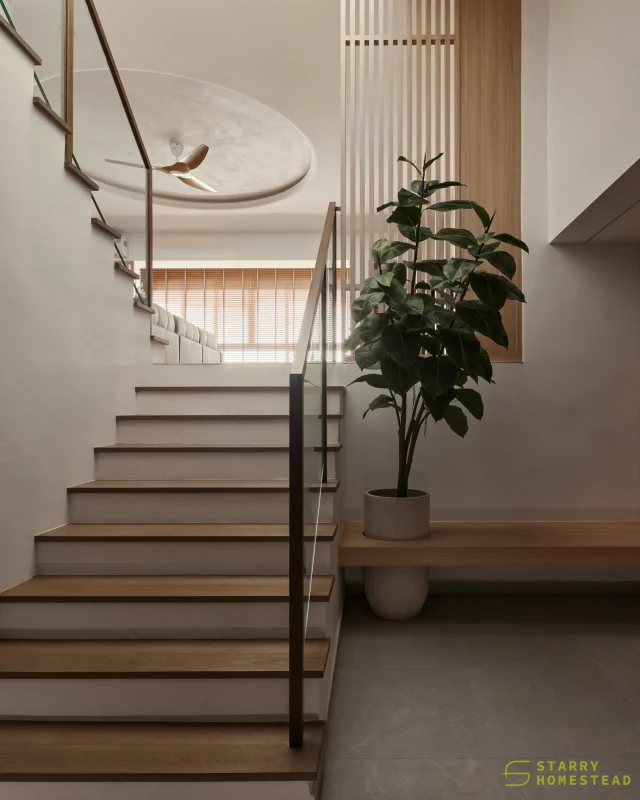
With white and grey as the primary colours and the generous use of natural materials such as wood, the room exudes a cosy vibe. Wood is used extensively at the entrance, extending from the floor to the ceiling so that one feels welcomed by the warmth upon entering the home. It is also a way to designate areas for different functionalities within the same space. Angeline’s piano is placed here as the design centrepiece in this area.
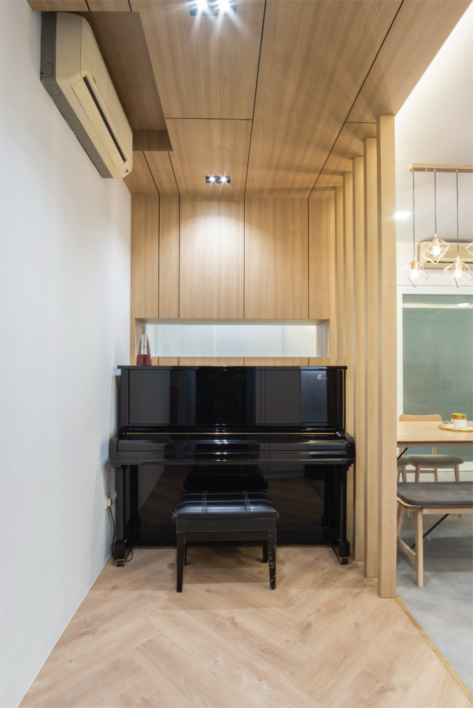
Wood is a timeless and versatile material that is perfect for the Modern style.
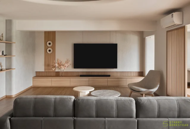
Moving to the living room, one feels comfortable immediately because of the linear, uncluttered design and the light, breezy colours. Wall-to-wall custom-built storage cabinets with movable shelves are incorporated so that the family members can adjust the height of the shelves for different storing needs. The cabinet interior has a grid design etched with open display shelves, which keeps the structure from looking too plain. The TV wall feature also incorporates top hung cabinet with length that is longer than the column space so as to redefine the structure of the space. The corner is deliberately cleared out so that the kids have space to play in the living room.
A partition with storage space is constructed behind the piano to provide the family with more means to stow away their things. Built with a see-through glass at the eye level, the partition also offers them some privacy for their bedrooms while allowing visibility of the main door. And to complete the design, a dining set with colours and wood pattern that match the rest of the living room is selected.
To brighten up the room, a range of lighting fixtures is installed for different functionalities, including general lighting, task and accent lightings and pendant lighting in the dining area. Much time is spent in getting the right colour temperature for the lighting. For example, the L-shaped cove lighting illuminates the space indirectly so that it can replicate daylight, and it comes with an independent switch for the owners to adjust the level of brightness to achieve the desired mood in the room at night. The right colour temperature is also crucial for the downlights and the spotlights in the walkway because wood tends to reflect yellow lighting, and thus creating a different effect on the overall ambience. Moreover, with young kids in the home, a brighter and whiter lighting is more appropriate for reading and studying.
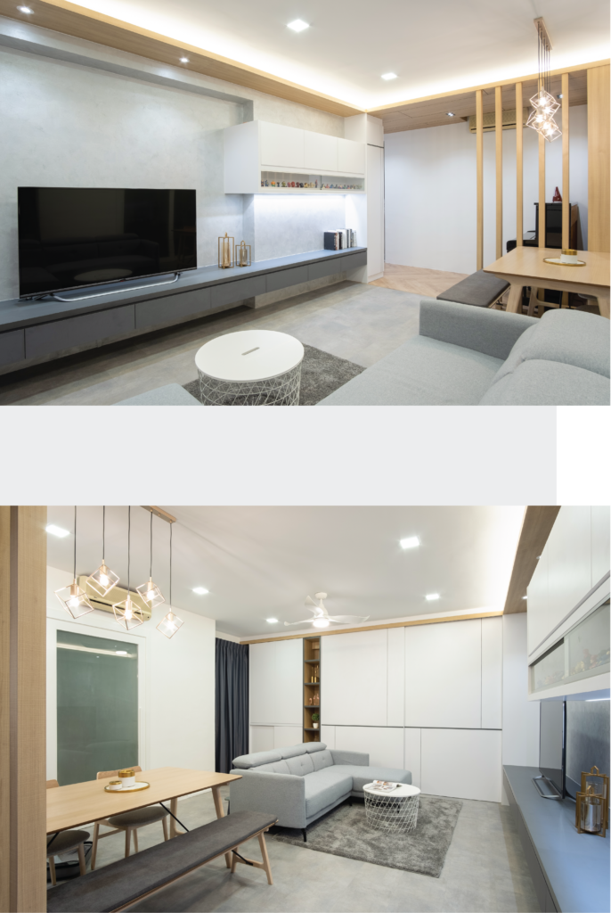
The Modern style: Less is more.
The Bonus
As Malcolm is an avid collector of comic figurines, a display shelf is specially added to the TV console to showcase his collection of figurines.
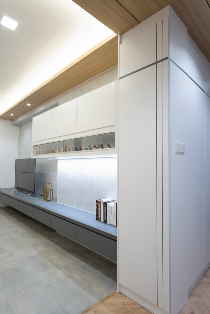
Malcolm’s impressive collection of figurines proudly displayed.
For more information about the Modern style of interior design, please contact the designer of this episode, Steven at tel. no. 6778 6866.
