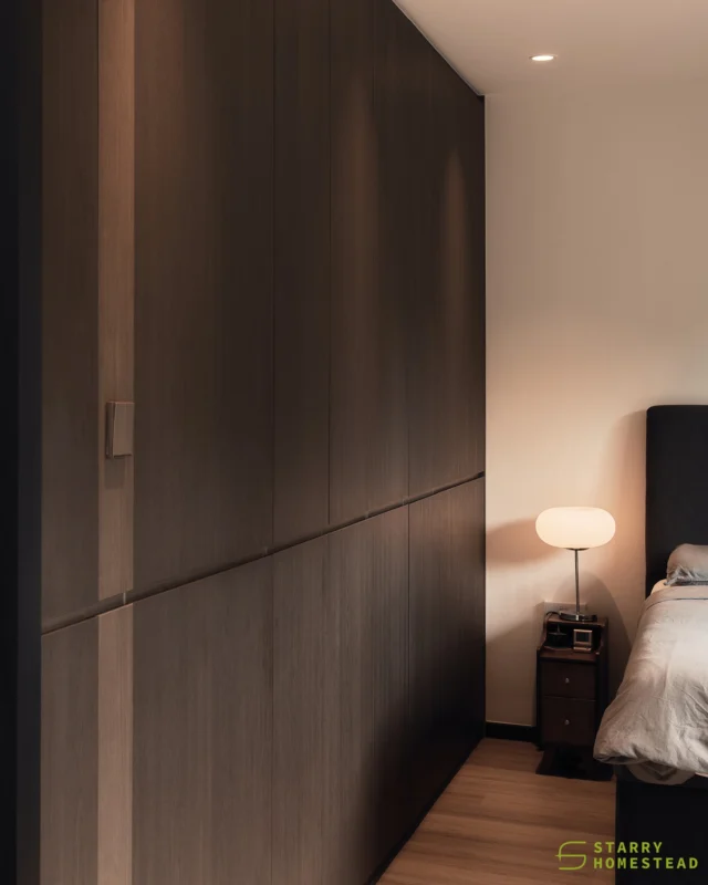
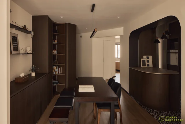
If you, like us, form part of the majority who dwell in an HDB flat, then there’s a chance that one of these magazine-worthy interiors belongs to your next-door neighbor or someone who stays in the same block as you. We never tire of transformation stories of the humble HDB apartment – mainly because most of us can relate to the situation, no matter if you’re staying in a timeworn resale flat or waiting anxiously for your first BTO apartment. Here, let us present to you dramatic before-and-after makeovers of flats from around our little sunny island that prove you can live big in a small space.
Area: Bukit Panjang Ring Road
The original condition of this resale flat may not be horrific to begin with, but it just didn’t suit the vibe of its hip young owners. Those antiquated tiles, surfaces and woodwork just had to go. A renovation was definitely in order for the couple.
Entry way
Talk about bad first impressions. The unsightly wall partition that stood beyond the home’s main door simply didn’t cut it. Now in its place is a super functional and versatile partition that also doubles as a showcase and storage piece. If you haven’t already noticed, check out the new front gate that exudes effortless old school vibe without looking passé.
Communal room
Pure white walls breathe new life into this revamped communal zone, while pale wood tone floors and wooden accent pieces ground its all-white look. There are reminders of Singapore’s yesteryears stylistically placed and interspersed within the apartment – and thankfully, no hints left of the interior’s old state.
Kitchen
Tight, cramped and dated cooking space – begone! The light and airy colour palette continues into the kitchen where it works its magic by making this area appear larger.
Common bathroom
We’d probably lose the urge to use the lavatory if it was still in the original condition. Fast forward to post-renovation and what we see now is what we like: a black-and-white bath space that may be simple but exudes minimal chic vibes.
Master bathroom
Black, white and grey hues make a winning combination in the bath space that once sported faded blue and yellowed tiles.
Area: Jalan Rumah Tinggi
The ‘60s was a cool era, but this flat sadly wasn’t. In fact, it exemplified everything we do not want in a home: a claustrophobic and narrow layout, tiny window openings, and loose pieces of mismatched furniture that look like they don’t belong into any sort of décor style at all.
Before: Living room
After: Living room
Atmospheric and brimming with rockstar attitude, this living quarters is barely recognizable from its former self. The daring use of dark tones that sheath the space only serves to inject it with an aura of enigma. What’s more, the stunning red brick wall offers textural appeal and brings about warmth into the apartment.
Dining room
From hawker center style plastic chairs to top-notch bar counter with an edgy vibe, the new dining area even boasts a handsome wall of display shelves that further augment the zone’s bar-like ambience.
Kitchen
The removal of a wall partition at the entrance of this kitchen made a massive impact. The result? A much more spacious cooking space that enables the owner to easily maneuver around the area.
Bedroom
From a bedroom that reeked of the past to a sleeping sanctuary that’s current, cool and on trend – this space has positively improved by leaps and bounds.
Bathroom
With its old-fashioned tiles and fittings, the previous bathroom truly looked like it belonged in the past – and there it should remain. The new space is covered with textured finishes that give it tons of character – making users overlook the cramped quarters and simply enjoy its ambience.
Area: Tampines
This resale flat located in the East lacked style and was terribly outdated, and it didn’t suit its young homeowners at all. To make matters worse, the wooden furniture and fittings made the tiny flat feel smaller than let on. What the home dwellers needed was a fresh start in this timeworn apartment.
Before: Living room
After: Living room
Inspired by Scandinavian homes, the living room is now brighter, breezier and perfectly built for the young couple. Who knew you could include so much in a single room? A feature worth noting is the wall partition that is used to mount the television on one side, and works as a seating and storage space on the other. We love how it effectively delineates two zones – the entry way and the living room – and also provides privacy to those unwinding on the sofa or chilling on the mini golf course.
Kitchen
A far cry from the days spent in a dull and inspiring cooking space, the revamped kitchen enjoys a sense of spaciousness with spanking new white and pale wood cabinet fronts combined with a sandy toned counter top. Notice the contrasting dark blue accent? We love how this unexpected jolt of colour adds a youthful vibe into this part of the home.
Bathroom
No more struggling to find space to hang towels or to stash away toiletries, the current bathroom is fully equipped with concealed storage, drawer compartments, towel rails, as well as handy nooks to keep the area free of chaos.
Bedroom
Minimal, clutter-free and completely Zen, this master suite allows the love birds to focus solely on getting their well-deserved R&R.
