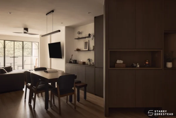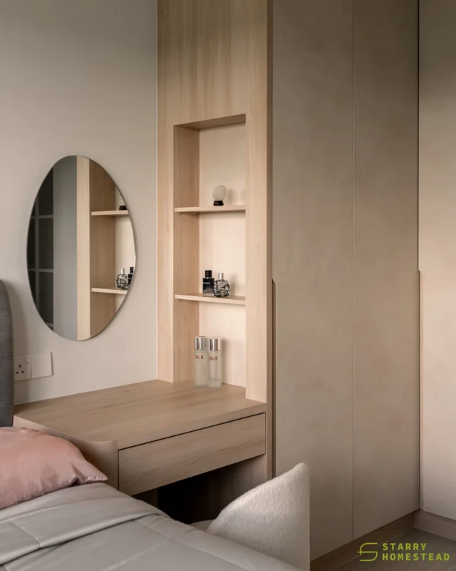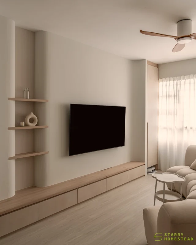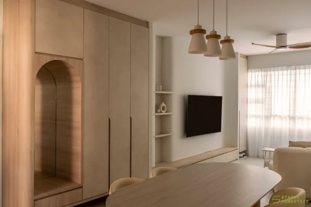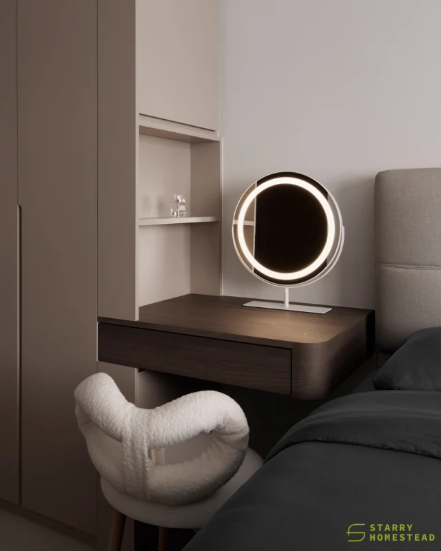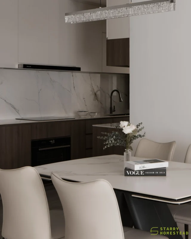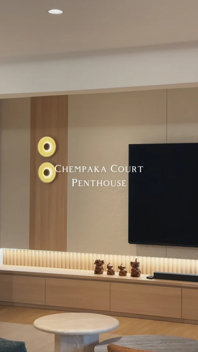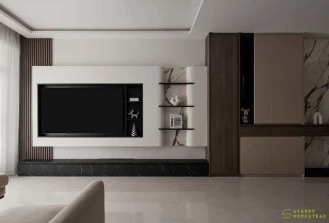
Many aesthetic concepts, such as space, shape, form, and colour, connect fashion and interior design. Fashion and interior designers can both draw inspiration from their respective industries and their forecasted trends for the year to create something unique and captivating. Today, we’ll take inspiration from Pantone’s New York Fashion Week Spring/Summer 2022 Colour Trend report and show you how to incorporate these colours into home interiors to create bubbly, award-winning interior designs.
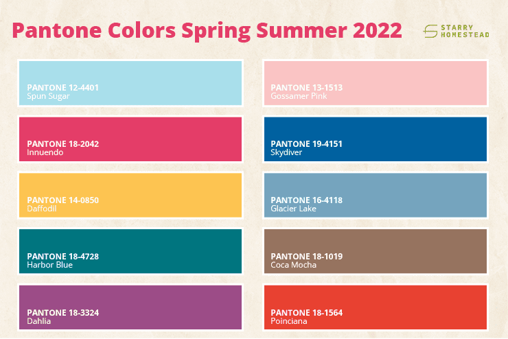
Pantone Colour Institute released a colour trend report for the fashion industry, forecasting the seasons’ top ten standout colours. These colours reflect our desire for balance in an uncertain and changing landscape by bringing together a range of comforting, soothing and timeless colours that celebrate playfulness. The 10 distinctive colours include
Here’s how you can incorporate these lively colours into your home interior design.
1. Spun Sugar & Gossamer Pink
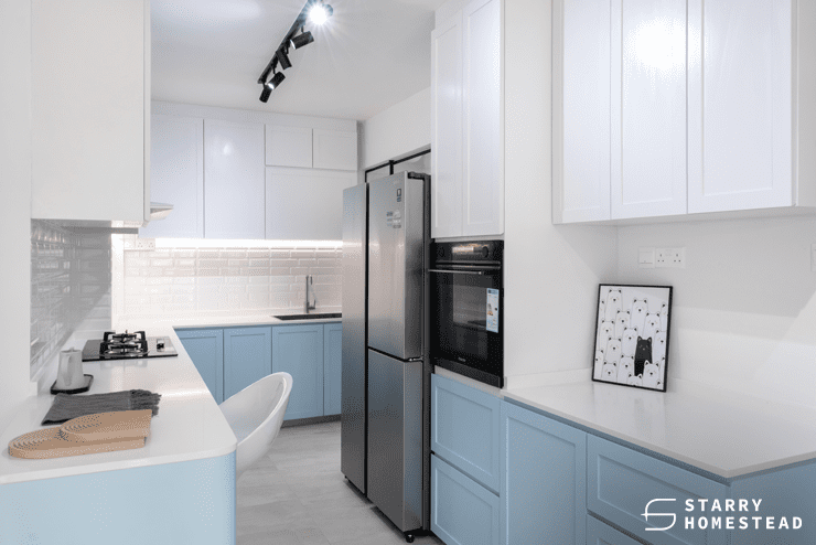
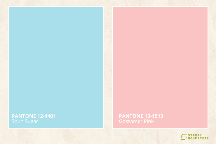
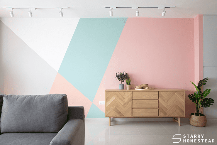
Both of these colours are sweet pastels with a light and airy feel to them. They have the ability to lift the mood and are ideal for homeowners who prefer a vibrant yet soft home interior design. Scandinavian, contemporary and even minimalist design styles would benefit greatly from these colours.
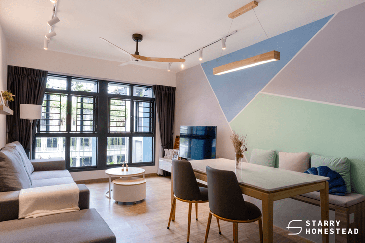
You can incorporate these colours into your living room by having them painted on a feature wall, or you can take things up a notch by creating a patterned wall with both colours, such as a checkered or stripe design. These colours can also be found on furniture; a light blue sofa or a pastel pink beanbag will add a lot of life to your home, and they can even be combined to create a sweet atmosphere that new parents can add to their baby room.
2. Skydiver, Harbor Blue, & Coca Mocha

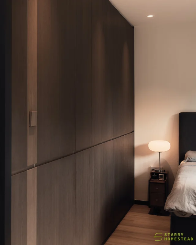
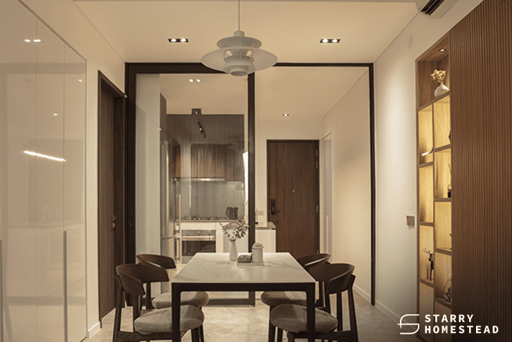
These three colours are the darkest of the ten featured in the colour trend report. Despite their dull appearance, they have warm undertones that will keep your home interior design from appearing too stark and cold. Modern, industrial, minimalist, and even Scandinavian interior design styles work well with these colours.
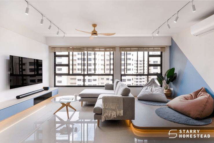
Create contrast by pairing these colours with tiled walls in your kitchen, or choose dark-coloured furniture against a bright and light backdrop for an interesting mix of styles.
3. Daffodil & Coca Mocha
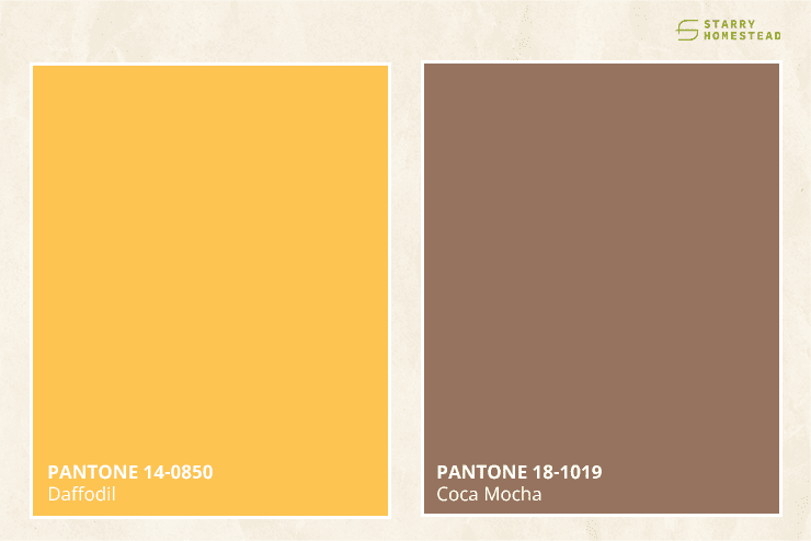
Yellow and brown tones compliment one another well. These colours can be used in many different home interior design styles, including mid-century modern, Scandinavian, rustic, American vintage, and many more. Daffodil’s bright yellow tones can be incorporated by using warm lights against a brown wooden background. This adds depth and warmth to your home. Other interesting combinations to consider include a dark brown leather sofa with bright yellow cushions or putting a yellow sofa against a dark brick wall.
4. Daffodil, Poinciana & Skydiver
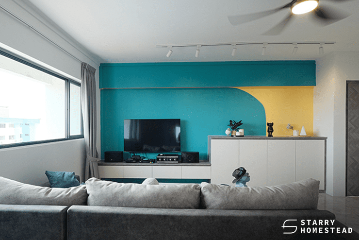
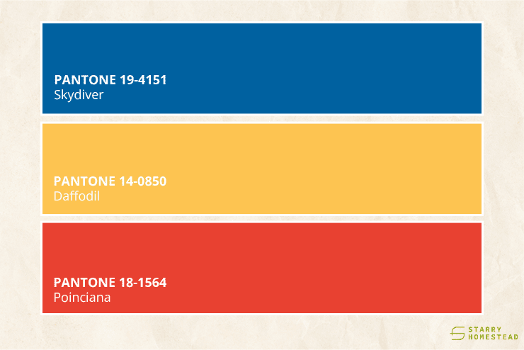
Finally, among the ten colours, these are the most striking and vibrant, and they can be used in a variety of design styles. Use ornaments and home accessories to add a touch of these colours to styles like modern, Scandinavian, and contemporary, or go bold and paint your walls in these colours to create an eclectic home.
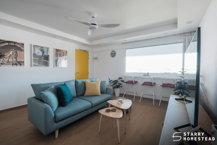
These are just a few ideas for how to pair the colours in Pantone’s NYFW Spring/Summer 2022 Colour Trend report, as well as which home interior design styles they would suit. If you’re feeling bold, you can even bring all the colours together by using small furnishings or painting different parts of your home in different colours to create contrast.

Want to give your home a makeover? Starry Homestead is an award-winning interior design company in Singapore with experienced home designers capable of transforming empty spaces into fully functional and trendy homes. Get in touch with us today for your first consultation.
