SPATIAL DESIGN
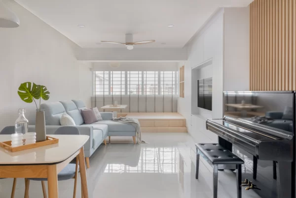
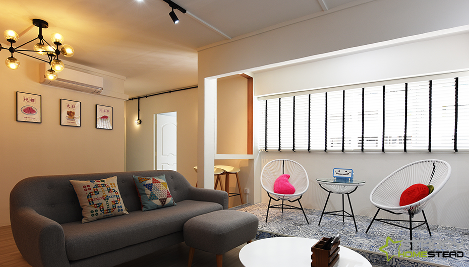
The play of spatial arrangement in this 5-room apartment is truly a unique and refreshing one. For starters, a major portion of the walls in the balcony in the living area was removed to connect the communal space into one. But instead of leaving it be, the design team raised the floor of this area to demarcate the zone without any physical barriers. This way, this open balcony area can either be utilised as a separate area for unwinding or used to expand the living room when extra seating is needed to accommodate more guests. At its side, a narrow counter top built into the window-like opening at the balcony allows guests or even the homeowners to sit on the bar stools and enjoy a snack or conversation.
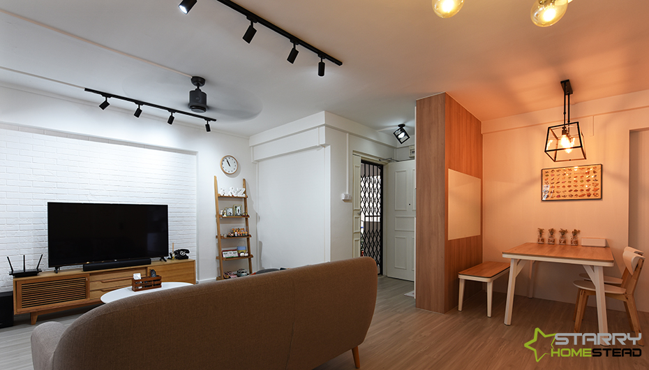
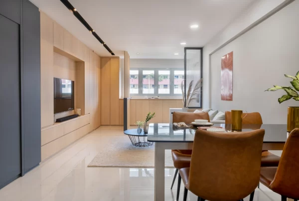
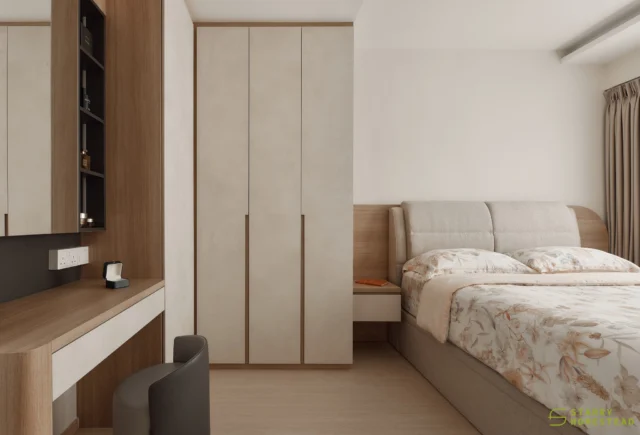
Further out, the main entrance into the apartment looks right into a custom made shoe cabinet that reaches the ceiling. It doubles as both a storage unit and a privacy measures for those sitting at the dining area that’s located right behind. In addition, it provides a closed-off effect to this space, so that meal times feel more personal and intimate. The master suite on the other hand also faced major space planning. The main bedroom in the original floorplan was converted into a walk-in wardrobe cum dresser and study station for the couple. By cordoning off the original door to the adjoining room and creating a new entryway that connects these two rooms together, the adjoining room now takes the role of a master suite.
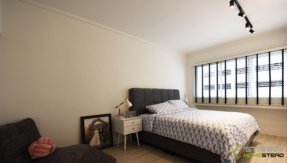
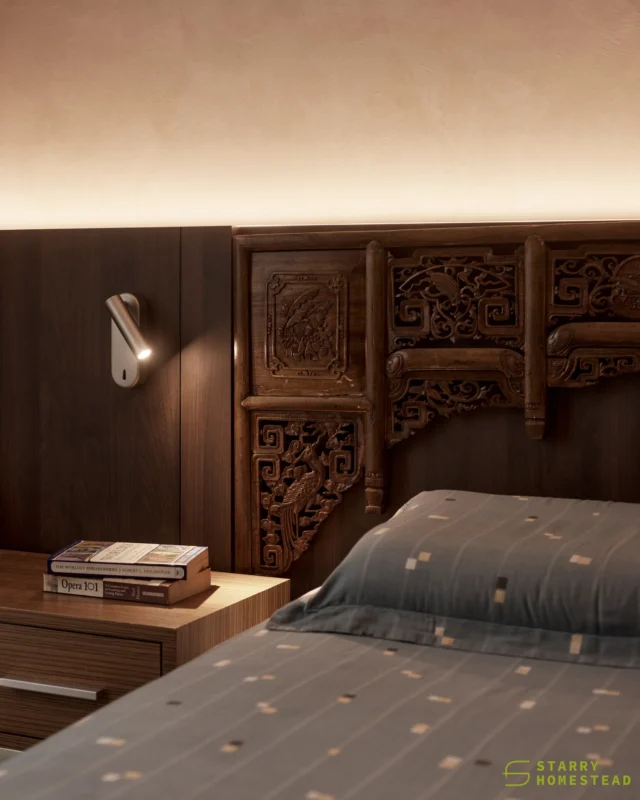
Deeper in the confines of the master suite where comfort is utmost priority, a contrasting shade of dark grey against the pale interior injects surprising warmth. The design team was smart to pick grey and not black, as this colour adds contrast without being too overwhelming in a place for solace. A beanbag lounger echoing the same shade sits by the side of the room – creating a cohesive flow with the rest of the dark coloured accents throughout the suite.
AESTHETICS
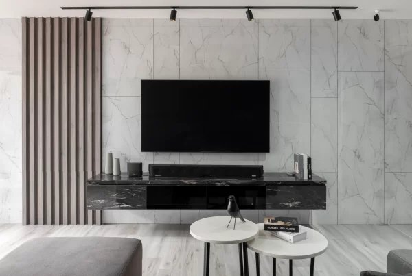
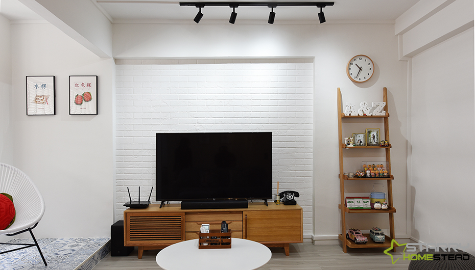
A vintage inspired grilled gate is reminiscent of Singapore’s past – and makes the perfect first impression for this home. A nostalgic vibe is omnipresent in the abode amidst its cosy Scandinavian style. This tasteful blend of interior style brings a distinctive look to the flat, making it look less like a typical HDB interior and more like a spacious studio apartment. Posters, prints and memorabilia that hark back to Singapore’s yesteryears are interspersed everywhere in the communal space – bringing heaps of character and a joyful vibe into this zone. The Peranakan tiles are not to be outdone. They truly go a long way in bringing out the colourful culture of the Lion City in this home; plus, the colours are a much-needed jolt in the all-white space. The dining area follows the same Scandi style of white-and-wood, creating visual harmony in the entire common area. Same goes with the kitchen. But wood appears in a more subtle way – across the countertops and strips that peek out from the drawers. The black grouting of the subway tiles may be subtle but it provides the right amount of contrast in this cooking space.

INNOVATION
The communal zone of this apartment truly spells originality. This social space was designed to be versatile and stylish, while encouraging interaction between friends and family effortlessly at the same time. At the balcony, the two Acapulco chairs can be turned in to face the window for both partners to enjoy some rest time and enjoy the view outside. With more guests in the pad, turn the chairs the other way round to offer more seating space and allow everyone to interact and mingle comfortably. Instead of completely demolishing the entire walls to the balcony, the design team made a clever move of letting the sides and top section of the walls go untouched. As a result, a small niche is created for two people to sit on bar stools and be free to use the space by the side of the balcony. This thus encourages the ability to commune even more. Over at the dining area, the way a corner is created simply by constructing a partition is also commendable. Not only does this wall help in creating an intimate nook for meal times, it is also functional. On the other side, a concealed shoe cabinet and an open display area showcases the owners’ odds and ends.
REALISATION EFFICIENCY
From the start, the homeowners wished for a Scandinavian style that had elements of Singapore’s culture. The design team definitely delivered this – and much more. Style wise, the execution of Scandi meets vintage flair is impeccable. The apartment is cool and chic, perfect for the young couple. Even with the old school collectibles, it appears far from dated. As Scandinavian style is known for its simplicity, incorporating the colourful Peranakan tiles in was tricky. But the team overcame this easily by choosing a pattern in an indigo and white combination, and furnished the space with a vintage inspired furniture set in monochrome. The Scandinavian theme stretches all the way into the kitchen; the all-white aesthetics making the space appear visually larger.
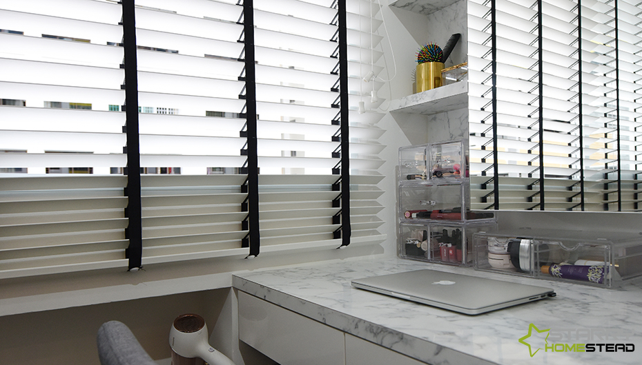
In the owners’ private haven, the decision to switch around the former master suite with its adjoining room was also right on point. Because of this switch, the bigger master suite is now a multipurpose room that the owners had always wanted. This space now fits a study station for two individuals, a massive wardrobe, and a dressing area all clothed in white and marble-effect surfaces to create an illusion of spaciousness and add a luxurious allure. Although not much structural alteration was made to the flat’s original floorplan, the design team’s knack for design and eye for detail transformed the drab apartment into a pad perfect for the young couple.