SPATIAL DESIGN
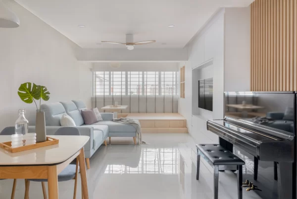
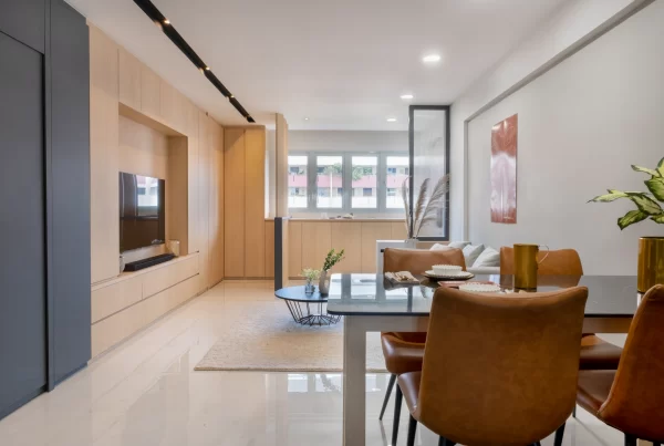
In this 3-room HDB resale flat, the original floorplan was drastically altered to make the best out of every square footage. Upon entry into the apartment, guests are immediately greeted by a spacious living room with a distinctive dining space sited on the right section of this sprawling communal area. This configuration was made possible by removing a wall that separated an existing bedroom from the originally smaller living room. The area where the newer and more spacious living room takes up belongs to the former bedroom, whereas the dining area sits on the former living area.

The original entryway into the kitchen was also repositioned and moved forward and into the new dining space to make way for the bathroom’s new entrance. This new door is far more accessible, removing the need for one to head all the way to the service yard to enter the bath space. What’s more, this ingenious move opened up a nook to fit the refrigerator. In the cooking space, the wall that separated the kitchen from the service yard was demolished to further expand this part of the house. As the homeowner didn’t need such a big space for laundry, dedicating more square footage for cooking was a more prudent move. Even though no walls were removed in the master suite, the spatial arrangement in this room was just as canny. Custom made open shelving as well as built-in wardrobe crafted to reach the ceiling made full use of vertical space, while a platform bed provided a comfortable place for rest and doubles as a smart storage space.

COMFORT
Although the industrial style is depicted as moody with raw surfaces, this apartment exudes an ambience of cocooning comfort without straying away from its edgy interior theme. The stunning feature wall that fronts the living area possesses a rustic vibe that elevates the home’s ambience. As red is an energizing hue, the brick red of the wall provides the perfect jolt of colour to uplift the interior’s grey backdrop. Wood-effect surfaces that cover the cabinetry and barn doors as well as the wooden coffee table bring nature’s beauty and warmth into the home too. The use of these surfaces harmonises with the handsome leather sofa and creates a cosy space for the homeowner – perfect for unwinding in front of the television after a long day. Underfoot, vinyl floors that cover the apartment make a comfortable surface to walk on. In addition, it is patterned in the likeness of wood to imbue depth and texture into the home.

Metal in dark hues is synonymous in industrial interiors – and it’s used generously and to gorgeous effect around this apartment. Iron pipe shelves that take pride of place on walls are as aesthetically exciting as they are functional; the black metal framed glass window atop the shoe cabinet echo the black lines of conduit piping that snake on the ceilings; while industrial inspired lights make their presence throughout the space.

INNOVATION
Custom made to tackle the communal area’s constrained space, this dining table cum shoe cabinet feature is a true marvel in innovation. It was the homeowner’s request to opt out of run-of-the-mill tables, so the design team proposed and crafted a bar counter table that’s also connected to a shoe cabinet with a paneled glass divider atop it. Not only is this surface great for meal times, it’s also versatile enough to be used for entertaining guests as well as for the homeowner to set up his work station whenever needed. Another innovative feature found in this apartment is the vintage inspired barn door. Apart from adding industrial appeal into the area, they also work perfectly for small spaces as no clearance is needed for the door to open as compared to a conventional door.

Away from the common area and into the master suite, the platform bed makes it to the list of innovative ideas implemented in this home. As space is a commodity particularly in this tight 3-room flat, the platform bed helped maximise every inch of space in the room. Not only are there storage compartments all along the sides of the platform, there is also space that can be accessed from the top. The owner’s belongings are not only hidden out of sight, they’re also stored within easy reach.

REALISATION EFFICIENCY
From a drab 3-room flat to a stylish industrial space that appears more spacious than it really is, the design team truly performed remarkably on this project. The industrial theme was executed with panache – the interior appears on point yet sports an individuality that is as unique as its owner. The team also fulfilled the owner’s request to maximise every square footage of the small space. This they did by altering the home’s original floor plan, crafting a unique bar counter table, building a platform bed, among many others. From the communal zone to the bath space, each room and every corner was meticulously thought through and is a testament to the team’s design expertise and eye for detail. Apart from aesthetics, the home is also fully equipped with everything the homeowner needs in a home. And storage is undoubtedly one important factor in a living space. Both the communal and private rooms of the home boast display shelves meant for showcasing his knick-knacks and injecting personality into the space. The concealed storage that’s built in the bedroom and next to the entry to the kitchen keeps his possessions hidden to ensure the apartment appears organised and tidy.
