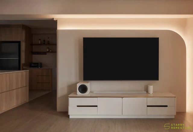
All Bright & Airy
They say first impressions are everything. And the impact that this apartment makes is certainly a lasting one. Upon entry, guests are immediately greeted by a foyer flooded with sunshine. The lack of conventional window grilles (hello invisible grilles!) certainly does a lot in allowing an abundance of natural sunlight to enter the premises. Underfoot, wood-effect tiles arranged in a timeless herringbone pattern line the entryway and help to effectively delineate this zone from the living area. A row of shoe cabinet purposely clad in the same pale tone as the walls seems to be camouflaged, giving no hint of the copious storage dedicated for the homeowners’ footwear collection. Along its top lay the owners’ collection of collectibles – each with a message, an adage, and holding a deeper meaning for the pair.
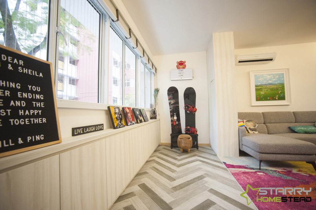
This gorgeous light-infused abode wasn’t nearly as bright and welcoming when the couple first laid eyes on its interior. Dated decades old with an interior to match, this resale unit simply didn’t suit the young owners’ more modern taste. What’s more, the lady of the house works in the fashion line and has a discerning sense of style. For help, they thus turned to Starry Homestead where the team transformed the dated interior into an ultra-chic modern Scandinavian dwelling that was perfect for the couple.

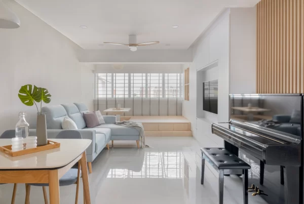
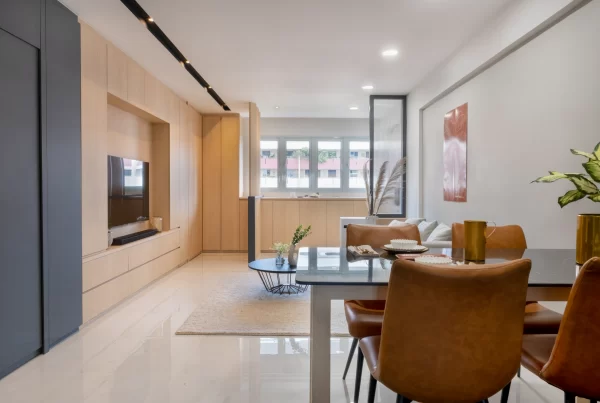
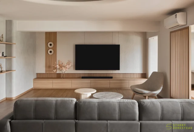
From the start, Sheila and Deon wanted an open-plan concept. The fact is the couple is big on entertaining, and an open interior is definitely more capable of accommodating larger groups at a go. Synonymous with spaciousness, it’s a small wonder why the Scandinavian theme hits all the right notes with the owners. As the overall layout and structure of the flat had to be drastically changed to make way for more space, walls were thus removed to bring more light into the interior. A soft and muted colour scheme comprising mostly white, cream and beige – a distinctive trait of the Scandi home – forms the foundation of this apartment. Here in the living area, elements such as the colourful patterned carpet, pastel blue coffee table that sits atop it, and painting above the sofa bring a refreshing dose of colour and verve into an understated setting.
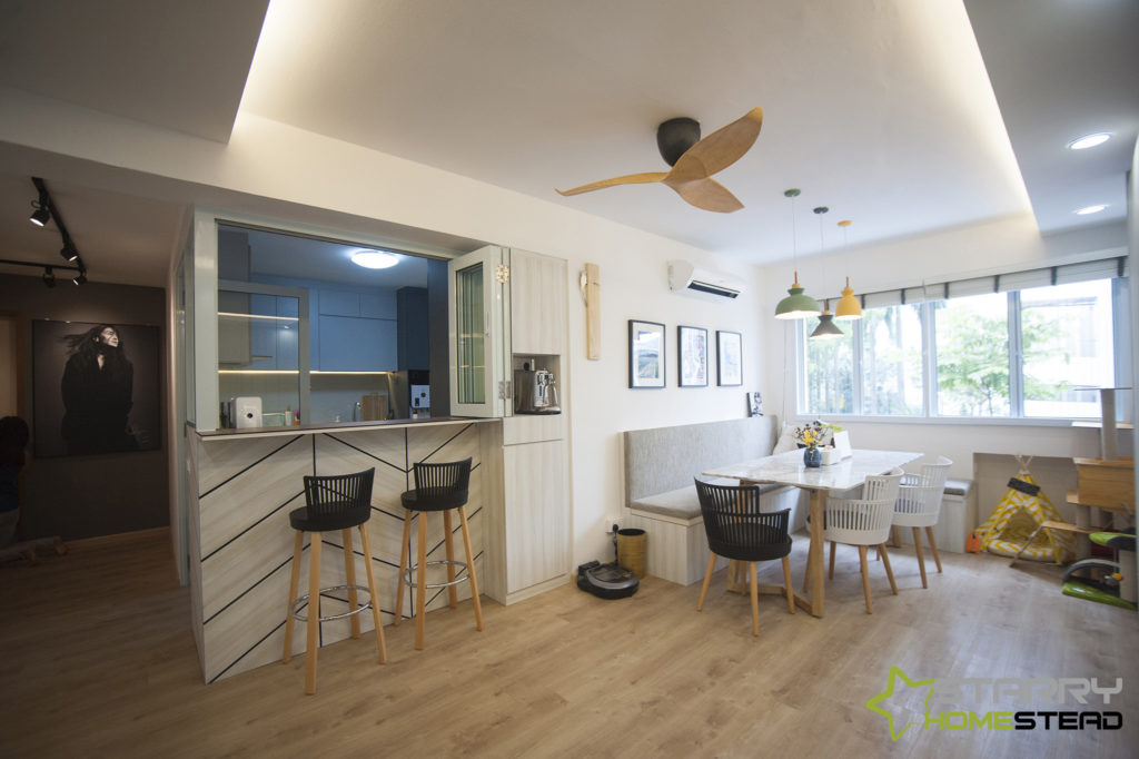
The couple’s social zone is a free-flowing space that inter-connects between the dining area, the breakfast nook and even the kitchen. Designed to fit a couple or a crowd, this place for socializing (and most importantly, mealtimes) encourages interaction, whether you wish to perch atop the barstool or prefer to chill by the window. Even the owners’ furry friend is not left out with a corner reserved for him. A specially designed kitchen window that overlooks the communal area folds and shut as needed – and allows conversations to be carried out across rooms. Aesthetic-wise, chevron-design paneling by the wall at the breakfast counter infuses the room with its chic Scandinavian appeal, while a mix of black and white chairs with wooden legs bring a modern edge to the look.
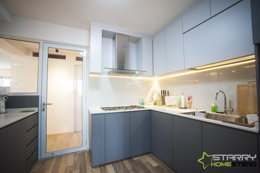
Caring person as Sheila, kitchen design not only according her requirement but also third party’s feel. To ensure unwanted fumes don’t escape out into the communal area, glass was chosen as the main material for partition. Apart from keep other rooms free of fumes, it allows light from outside to sneak into kitchen and make the space appear brighter.
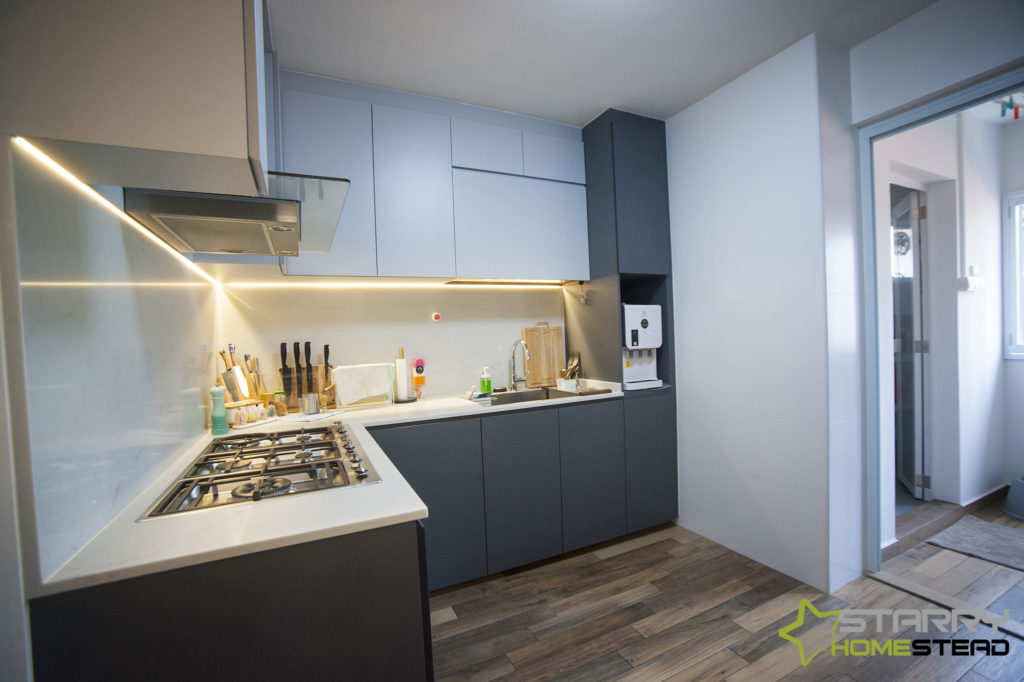
Within the premise of the kitchen, cabinet fronts in contrasting shades of black and white create a beguiling appearance. They, in fact, echo a similar monochromatic effect that is interplayed around the apartment. Quartz in textured white clads the countertop and runs up across the backsplash for a seamless look. On the floors, the wood-effect tiles may be darker than those found in the other rooms, but they look right on point in this modern cooking space.
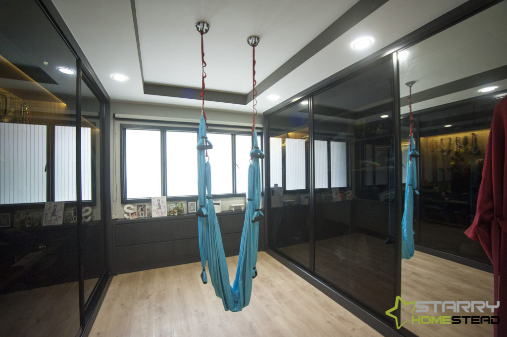
One of Sheila’s requests was for a walk-in wardrobe. To enhance her daily dress-up ritual, the design team fitted lightings within the wardrobe that switch on whenever the doors are slid open. Apart from ensuring there’s ample storage space to accommodate her collection of apparels, a massive pegboard with 100 holes was also built to allow the fashion-forward individual the liberty to hang all of her favourite accessories. In addition, a reflective finish was chosen for the sliding doors so that they can double as a mirror, allowing the fitness buff to view her reflection when she’s doing her yoga exercises.
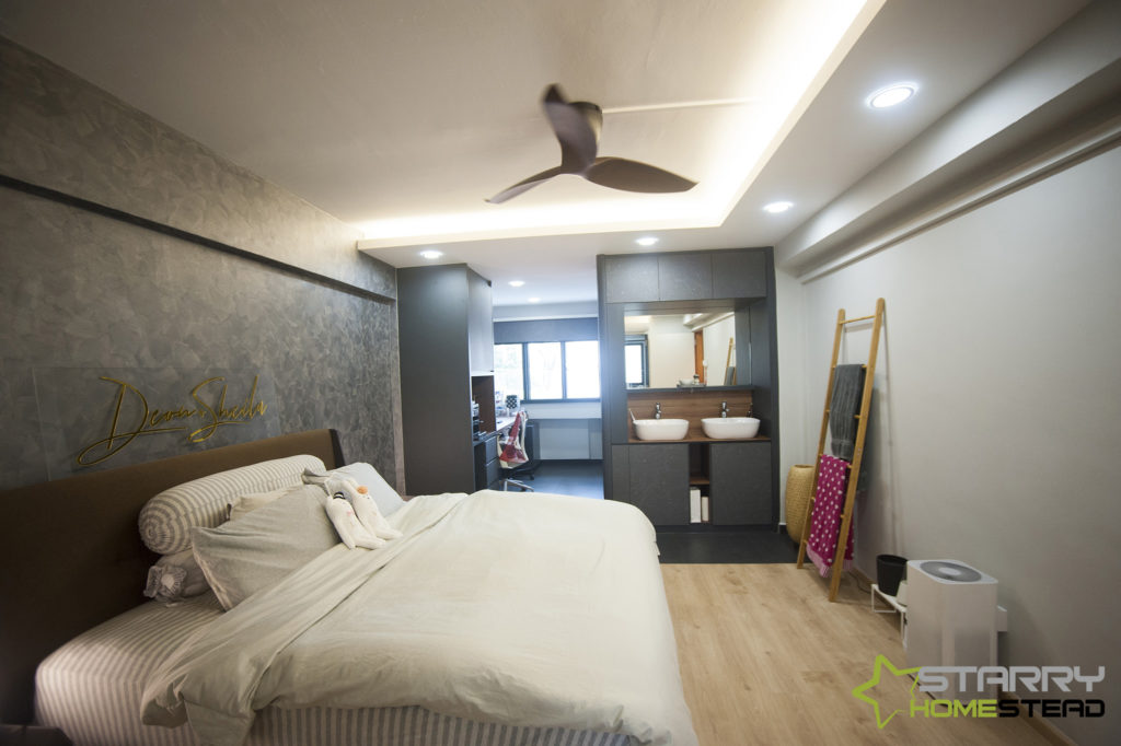
Deeper within the confines of their master bedroom, the wall that backs the couple’s bed instantly makes an impact. Apart from scoring aesthetic points, it also wins brownie points in the ingenuity department. Painted purely by hand, this cost-saving move doesn’t require fancy wall installations or wallpaper; just some nifty techniques with the good old paint brush. Gold embossed letterings of the lovebirds’ names are inked onto a piece of acrylic to make it seem as if their names are floating atop the headboard. Within proximity, a pair of wash basins complete with a massive mirror and storage nooks eases the struggle of waking up on early workday mornings. However, they’re not just there for practical purposes. The owners requested for a water feature to be installed and specifically positioned at this part of the room for Feng Shui reasons.
Current, chic and completely made for both Sheila and Deon’s lifestyle needs and habits, the couple’s newly renovated pad serves as the perfect place for the lovebirds to embark on their life journey together.
If this project interests you, click here for more !
